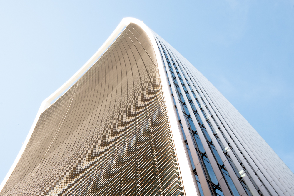
20 Fenchurch Street (The Walkie Talkie)
The fact that this building just won the “Carbuncle Cup” for ugliest building in the UK is quite disappointing to me! Yes its big and bold… and melts the occasional Jaguar but its almost because of that, that I think it’s great. And yes you read that right, the concave of the building meant that the suns rays were channelled and created an intense beam melting the body work of a Jaguar parked below. Diversifying from the norm is what modern design is all about. Rafael Viñoly, the architect behind the design of this building, also designed a building in Las Vegas which basically did the same thing . It melted handbags belonging to residents who were tanning by the pool. The top of the Walkie Talkie is also home to a 3 story roof garden which I’m still keen to visit, even though its been compared to an airport terminal. Personally I wouldn’t mind an airport terminal 160 metres high!
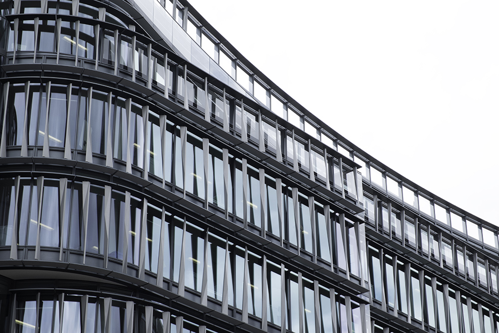
Sixty London
Walking to work in Clerkenwell, the centre for commercial interior design in London, I pass this unusually stunning building designed by Kohn Pederson Fox Architects (who also designed the Heron Tower) which is the home to Amazon offices. Even though ever so slightly out of my way when heading into town, I happily make that slight detour just to marvel at this building and the unusual curved fins which make it such an eye-catching structure.
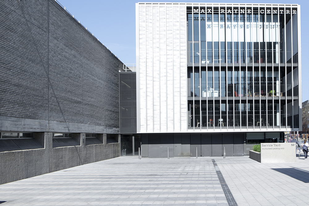
Max Rayne Centre
So much of my time is spent on the Southbank. Just walking with my camera and a coffee, gathering my thoughts and appreciating the views of this incredible city. Located just behind the National Theatre is The Max Rayne Centre, home to design studios, a production studio and work space for artists. Named after Lord (Max) Rayne, the National Theatres longest serving chairman, the new centre was designed by Haworth Tompkins Architects. I think is a stunning addition to the brutalist architecture of the theatre itself.
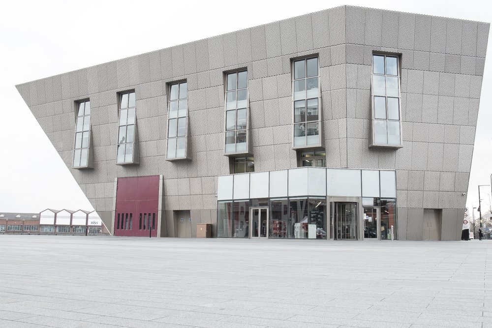
Canada Water Library
Having lived in Canada Water for a couple of years, it seemed to me that change was required to a part of London which I felt was still trying to find its identity. One of the key defining areas was around the tube station and shopping centre which is a hub for activity in the area. What better way to make a statement than with a public library designed a bit like an inverted sculptural hexagon? This eye catching structure is the creation of Piers Gough at CZWG architects. A beautiful communal space which brings together the local community of Southwark and offers an escape from busy London life.
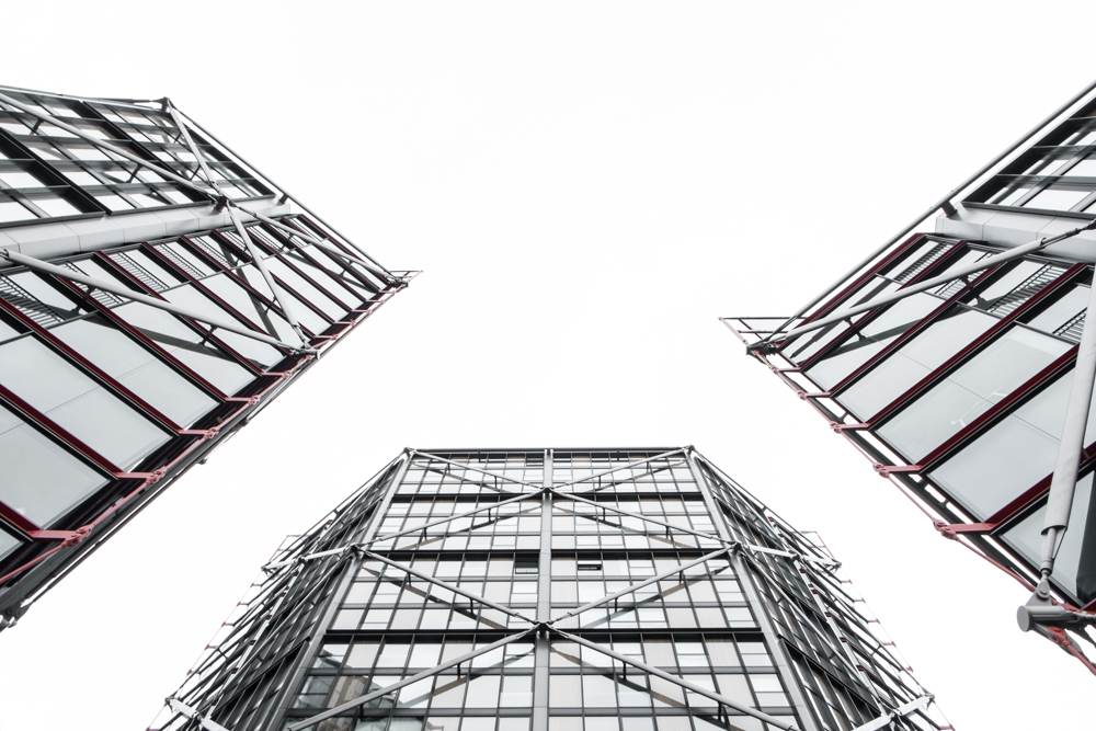
Neo Bankside Apartments
My obsession with art constantly draws me back to The Tate Modern. A few years ago, Rogers Stirk Harbour and Partners were commissioned to build some new apartments, overlooking the gallery. This development at Neo Bankside makes use of an exterior, almost skeletal, bracing system in order to eliminate the need to interior structural walls. A similar design concept used in the design of the new London Skyscraper, the Leadenhall building or “Cheese Grater” as its affectionately known. What I love is that this is a perfect example of design evolution in architecture.
Words and photography by Neil Kenyon – founder of ARKI magazine. He works with all parties, from designer to sub-contractor in order to showcase the dedication put in by those involved in the creation of the beautiful buildings which form part of our everyday lives.
